
Mitchell SmartAdvisor
Out with the old, in with the new.
By 2015 the cumbersome maintenance of the legacy system, SmartAdvisor, had finally caught up with new business, or lack thereof. Realizing that onboarding the platform to their business would require months of implementation and hours of configurations, clients were not signing any contracts. Something had to change.
I was part of the redesign initiative to transform this legacy system into a more efficient experience.
Product: Mitchell SmartAdvisor
Features: Account Setup and Maintenance
Year: 2017 - 2018
Duration: 10 months
Role: Experience Designer & Project Manager
The old design (left) compared to the redesign (right).
Problem Space.
SmartAdvisor is Mitchell’s medical bill review platform. Users can highly customize the settings of the application based on their business needs, a feature called Account Maintenance. The level of customization is robust with over 100 settings to configure, but more is not always better. Customers found it overwhelming and inefficient trying to understand all the available settings.
The platform is a legacy system with over 30 years in its back pocket. Nobody had ventured to redesign it, until 2015. By this year, the process of implementing SmartAdvisor was a major obstacle to bringing in new business. It would take months to setup the application and additional hours from the client to maintain — something they couldn’t afford.

The Challenge.
The objective of the project was to create a more efficient experience without an overhaul of the entire legacy system. We knew we had to build upon the current technology architecture. Our ambitions were to create a less cumbersome onboarding and maintenance experience that could be sustained with the legacy framework.
Our goals were to:
01.
Make it easy and fast for clients to setup SmartAdvisor.
02.
Save users time by making it more efficient to maintain the platform.
03.
Help users understand all their setting options.
My Role.
I was the lead designer for the project, tackling user research, design and testing of all pages. I also managed the timeline by prioritizing deliverables and setting up deadlines.
In addition, I collaborated with team members of the Experience Design Team, Business Analysts, Product Managers and Software Engineers throughout the redesign initiative.
The Process.
01. Project Management
02. Discover
User Interviews
Contextual Inquiry
03. Define
User Persona
User Journey
Design Sprint
Design Concept Validation
04. Design
Sketching
Feedback Sessions
Usability Testing
Iterations
01. Project Management
This was a massive undertaking that involved a long list of deliverables, so it was essential to clearly delineate the roadmap within the time frame that was allotted for the project. I separated deliverables into phases, with each phase composed of 3 steps: Ideation, Usability Testing and Design Iterations.
I created and followed a very detailed schedule to stay on track. However, to share the timeline with other teams, I created a more high-level version.
02. Discover
User Interviews & Contextual Inquiry.
On-site interviews and contextual inquiries were conducted with 6 customers currently using SmartAdvisor. Our target personas were managers and configurators (i.e. specific personnel responsible for the maintenance of the platform).
Insights.
01. Configurations are cumbersome.
The legacy system only allows for a single account and state to be edited at once. Hours are spent making multiple configurations, over and over again.
02. Configurations are largely the same across all accounts.
The majority of settings are the same across the business, except for a few one-offs.
03. “I can’t remember all the settings and what they mean.” - Configurator
With over 100 settings, it is difficult for users to remember the effect of each.
04. There is no way to audit changes made.
When problems arise due to configurations, there is no way to track where the error occurred.
03. Define
User Persona.
With the information gained during discovery research, a user persona was created. This helped us identify their pain-points, goals and the context when using the platform.
User Journey.
During discovery research, we asked users about their workflow for setting up SmartAdvisor. The steps in the process and their pain points were documented in a user journey. This helped us visualize their feedback and identify opportunities in the onboarding process.
04. Design
Design Sprint.
We gathered a cross-functional team and conducted a modified version of Google’s design sprint. We shared the insights from discovery research and met for 3 days to discuss the redesign strategy of the project. We were then able to clearly identify opportunities to define our roadmap.
Opportunities.
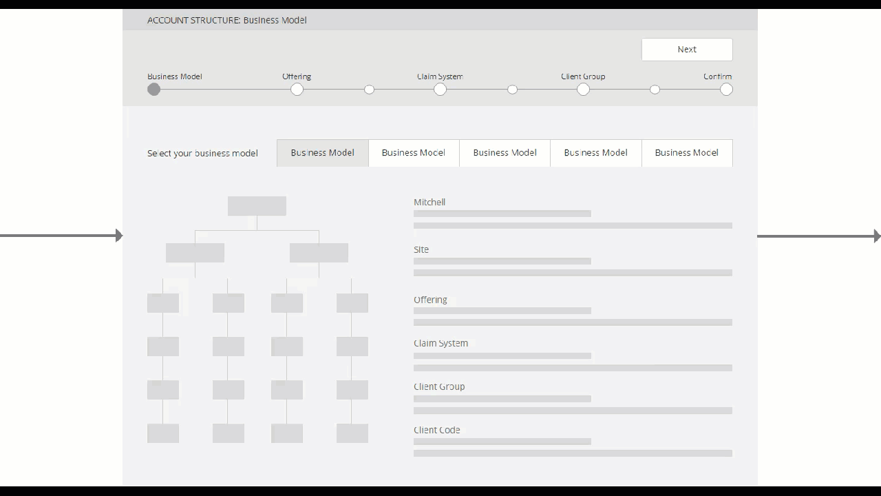
01. Introduce a new hierarchical model.
Implement a hierarchical model that will allow users to make configurations with a larger impact.
02. Apply mass configurations.
Allow users to configure more than one setting at a time to make maintenance more efficient.
03. Create a quicker onboarding experience.
Design a self-guided setup so new clients can onboard quickly and start using SmartAdvisor ASAP.
04. On demand help.
Identify where in the workflow users need to access help on the settings and provide that information on demand.
05. Capture a history of changes made.
Track all configurations so users can audit and pinpoint where errors have been made.
Design Concept Validation.
The opportunities identified in the Design Sprint were incorporated into a design concept that depicted a new workflow from onboarding to maintenance. I shared this with 4 users and their feedback determined if we were heading the right direction.
Design concept workflow demo
Sketching.
I sketched and white boarded multiple variations of the pages and workflows. Testing out ideas through quick visuals was the most efficient way to iterate through several solutions. I shared these with other Experience Designers for feedback.
Feedback Sessions.
After sketching, I created a prototype and presented it to a cross-functional team. It was important to share this with not only Experience Designers but also other stakeholders (i.e. Business Analysts, Software Engineers, Customer Support, etc.). The diverse team provided more comprehensive feedback and improvements to the prototype.
Usability Testing.
Once the prototypes were reviewed by the team and updates were made, I conducted remote usability tests. To prepare for each session, I created a script and a series of tasks to be tested. The results helped identify areas in the design that users were having trouble with. I facilitated a total of 12 usability tests during the span of the entire project.
Example task for usability testing
Iterations.
Based on the results of the usability tests, I made design iterations on the prototypes by incorporating feedback provided during the sessions.
You can see the transformation of the designs as we did multiple rounds of testing and iterating.
Usability Test Round 01.
What we learned:
Make actions easy to find.
We observed discoverability issues with the “Edit Settings” link. This changed to a button to make it easier to find.
Meet user expectations for search.
Multi-select for search results did not match user’s expectations of how searches work. This changed to single-select.
Usability Test Round 02.
What we learned:
When I see it, I want to take action on it.
Once users found the setting in the grid, they clicked on it expecting to configure it. During iteration, an edit icon was included next to each setting to meet user’s expectations.
Let me search for it.
With over 100 settings, including a search field in the grid can help users quickly find their desired configuration.
Usability Test Round 03.
What we learned:
I don’t understand my options.
In the Confirm stage, users are tasked with selecting one of three options. All users struggled to complete this task, which prompted a redesign for this page. The challenge is documented in the next section.
Challenges.
A part of the design kept failing during usability tests, which proved to be one of the most challenging problems to solve.
After configuring settings, users make a choice between 3 options. The concepts are complex and users had trouble understanding each one. We asked them why and this is what we found out:
“There are too many words.”
Users trail off when reading each option.
“I don’t understand how they’re different.”
There is not enough information to distinguish how each option will impact their configurations and accounts.
The page users struggled with during usability tests
Redesign the Redesign.
I went back to the white board and began brainstorming. I collaborated with 2 other Experience Designers from the team to ideate on a new solution for this part of the workflow. We created multiple iterations and the design evolved from each version.
Multiple designs we went through
The Result.
After several iterations the redesign involved:
Lower the number of choices.
Less choices throughout the workflow helps reduce the cognitive load required to make a decision.
Showing is better than telling.
In this case — it’s better than reading. Users can toggle between options and see the differences in the grid below.
Provide examples.
Users can see the impact of each option with the configurations they’ve just made. This demonstrates the change’s implications to help users make their decision.
The end result of the page
Hallway Testing.
In order to test out this redesign, I conducted hallway testing. This involved recruiting “people down the hallway”, i.e. participants that are unfamiliar with the project. I really wanted to figure out if anyone would be able to understand these concepts with the new design.
The test required participants to match an example outcome with the correct option using the prototype provided. I conducted 2 rounds of hallway testing with a total of 12 participants. I made design updates after the first round and then retested with a second round. The results at the end were surprising — in the second round, users were able to more accurately choose the correct option. This indicated the design had improved from previous versions and was headed the right direction.
The accuracy in choosing the correct option
increased by 28% in the final round of hallway testing
The Solution.
The redesign of SmartAdvisor Account Setup and Maintenance enables users to be more productive by transforming their cumbersome out-dated experience into a more efficient one.
Self-Guided Onboarding.
Users can quickly and independently set up their account during onboarding. Previously, this was entirely done by Mitchell’s Implementation team. With the new design, users are now able to do this themselves.
Mass Configurations.
Users can now make multiple setting changes at once, saving them time and effort during maintenance.
Cascading Effect.
With the new hierarchical model, users can cascade their configurations across multiple accounts. This allows them to more efficiently apply changes, since the majority of their settings are the same across their business.
On Demand Help.
Information about each of the settings is available to the user at crucial moments in their workflow.
The Impact.
The new design will transform the previously cumbersome process into a more efficient experience.
We gathered feedback during usability tests that predicted how the redesign will impact user’s workflows.
A task that took 1 hour will now take 7 minutes.
88% time saved during configurations.
Users can be 8.5x more efficient.
User Quotes.
“I think this is extremely wonderful. Very easy, very useful and saves us tons of time.”
“I think it’s a pretty cool concept. Takes less time. Accuracy too is better.”
“So does this mean we don’t have to do it 52 times? [Yes] That is music to my ears!”
“This is HUGE! Currently, it’s very labor intensive.”